| HTML |
|---|
<style>
.text-span-6 {
    background-image: linear-gradient(99deg, rgba(170, 163, 239, .5), rgba(125, 203, 207, .5));
    border-radius: 50px;
    padding-left: 15px;
    padding-right: 15px;
}

#title-text {
display: none;
}

.panelgradient {
    background-image: linear-gradient(180deg, #d5def0, whitesmoke);
    border-radius: 8px;
    flex-direction: column;
    justify-content: center;
    align-items: center;
    padding: 4rem;
    display: flex;
    position: relative;
}

</style>


<div class ="panelgradient">

<h1 style="text-align: center;">Draw<br>(Displays and Symbols)</h1>

</div> |
Introduction to Drawing User Interfaces
The Drawing Features provide the procedures
About the Drawing tools
n this chapter, we will focus on the tools and techniques to create and customize displays and symbols in Tatsoft FactoryStudio. We will explore the drawing tools and features available to design interactive and visually appealing user interfaces. Additionally, we will delve into dynamic behavior on screen elements, symbols, user control components, and display code-behind programming<< To Do >> << Add more one paragraph here, like an Overview and concept >>.
It includes powerful vector drawing tools for process diagrams and the creation of custom objects and symbols. It also allows dynamic behavior for:
- On-screen elements with various dynamic options
- Smart Symbols
- User Control Components
- Display Code-Behind Programming
You can access the Drawing environment using the navigation path Displays → Draw or the Draw shortcut icon on top of the Solution Explorer.
On this page:
| Table of Contents | ||||||
|---|---|---|---|---|---|---|
|
Key Concepts
And Terminologyand Terms
Graphical Element
When drawing displays, any object placed on the screen is defined as a Graphical Element. It can be simple objects like a rectangle, or controls like a CheckBox or TrendChart.
Dynamics
In the context of the Drawing tool, Dynamics are real-time behaviors you can use on a Graphical Element. For instance, you can add the Dynamic of Color Change to Rectangle and define the real-time Tag that will drive the color change.
Smart Symbols
Smart Symbols — or Symbols for short — is a platform feature that combines graphical Elements with Dynamics properties and connection to the real-time Tags and templates.
The Symbols vastly expedite the creation of Operator Users Interfaces, and simplify the maintenance, as changes on the Symbols propagate automatically to the Displays using it.
Components and User Controls
In context of the drawing tools... <add definition >>
Image Resources
Image files imported to the Project. The Image Resources can be applied as background color, or even as a Dynamic color change, to any Graphical Element.
The Drawing Area and Its Features
In this section will present:
Overview of the drawing area in Tatsoft FactoryStudio
Accessing the drawing tools and customizing the environment
Features Highlights and Capabilities
Drawing Area Workspace
<<Explanation of workspace
Accessing and customization
When clicking the Draw button in the ProjectDesigner, the toolbars are changed to present the Drawing Tools.The Draw area is where you create and edit the displays, create and modify symbols, and do the Display CodevBehind programming.
<<contens
Features Highlights and Capabilities
Some features available in the Drawing tool include:
- Cross-Platform: Use the advanced WPF drawing features to create HTML5 pages.
- Symbols are fully customizable and new symbols can be created from the green field.
- The concept of open Dynamic properties brings the flexibility to deliver any UNI requirement.
- Advanced components for Trending, Alarms, DataGrids, Gantt, Maps, BarCharts and many others.
- Third-party components can be easily integrated, and new built-in components are frequently created.
<<<<.please review the content of this paragraph>>>> - Image files can be imported into the Project as Resources, so you do not need to keep the image file anymore.
- The Image Resources can be applied as a painting Brush to any element.
- Import XAML and AUTOCAD drawings into the system as a vector object.
- Many Productivity tools, like Copy-Paste dynamic properties, edit multiple objects, search replace tags.
- Select the objects in the display, or use the ObjectTree View.
- Flexible Grid Snapping and zoom settings.
Working with Graphical Elements
This section will cover:
Understanding the concept of graphical elements
Creating and editing basic shapes, text, images, and controls
Configuring element properties and behavior
Graphical elements are the components used in the interface, such as shapes, checkboxes or trend charts.
Dynamics and Animations
Dynamics and animations are real-time changes that can be applied to graphical elements to communicate different messages. For example, a rectangle's color can be changed dynamically based on the value of a real-time tag.
Image Resources
Image resources are imported image files that can be used in your solution as graphical elements.
Industrial Icons
Industrial icons are a pre-built set of icons designed specifically for use in industrial automation applications.
Smart Symbols
Smart symbols are graphical elements that combine visual representation with dynamic properties and connections
Adding Dynamics to Screen Elements
to real-time tags and templates
Symbols, Images, and Repositories
- Understanding the concept of smart symbols
- Exploring images, Symbol Factory library, and Local Symbols Gallery
- Using built-in symbols and components
- Creating and managing custom symbols and components
- Importing and exporting symbols and components
User Controls and External Components
Introduction to dynamic objects, smart symbols, and UI controls
Utilizing platform UI controls, Windows UI controls, and extensible components
Integrating external components in FactoryStudio displays
Preparing the Application Navigation
Understanding the concept of application navigation
Organizing the navigation of pages for users
Display Modes: Pages, Dialogs, and Popups
Responsive Design and Dashboard Layouts
Implementing responsive design principles
Working with grid layouts to create adaptable and flexible user interfaces
Code-Behind Programming
Overview of display code-behind programming
Writing code in VB.Net or CSharp and automatic language conversion
Defining event handling methods for mouse and input commands
Utilizing pre-defined methods for handling display opening, closing, and dialog actions
Specific Tips and Best Practices
Design guidelines and recommendations for creating effective and user-friendly displays and symbols
Optimizing performance and resource usage in complex screens
Display Mode
Pages, dialogs, and pop-up are different display modes, they share some common, but each one have a specific particularly or behavior. They are commonly used in application development to build intuitive and dinamics user-interfaces.
| Info |
|---|
| This feature brings speed-up to your digital solution development, it allows you think more about business solution and less about codes. |
.
Components and User Controls
Components and user controls refer to the customizable objects and elements used to create interactive displays. These objects can range from pre-built controls, like alarm windows and trend charts, to custom-designed components tailored to your specific application requirements.
.NET CodeBehind
.NET CodeBehind is a programming feature that allows you to write custom code in VB.NET or C# for your solution. This code can be used to define event handling methods, perform calculations, or manage application behavior based on user input or real-time data.
Drawing Tool Workspace

 Expand or Collapse the Solution Explorer
The Left side panels allows the selection of graphical elements to add the display
The Toolbars are detailed on page Toolbars and Panels.
The Right side accommodates two panels:
- Tree to Allow DragDrop tags to displays. See Graphical Components.
- Drawing Properties, which shows the attributes for the selected element and for the current display.
In order to inspire the properties one element on the displays, execute a double click with mouse on the element.
Navigation
- Select other pages using the top ComboBox
- Use the top-right side short-cuts to other Displays Module tools
- Use the icons on the left side to go back to other modules (by default, last section used of the module) or expand the Solution Explorer
Drawing Displays
Using Graphical Basic Elements
Users can draw graphical basic elements such as shapes, lines, text, and images using the drawing tools provided in the Drawing Workspace toolbar.
→ Read more about Toolbars and Panels.
Using Components or Controls
Users can add components for advanced functionally, such as DataGrid, AssetTreeView, TrendChart, Gauges, PdfViewer, and various others.
→ Read more about Graphical Components
Using Smart Symbols
Users can use the extensive Symbol Library, or create new Symbols based on the Library, or with the drawing primitives and adding the dynamic behavior directly.
→ Read more about Smart Symbols.
Adding Tags to Displays
The software platform allows users to easily paste tags onto their displays, automatically generating appropriate symbols and data bindings.
→ Read more about Insert Tags To Displays.
Customize Dynamic Behavior
The software platform enables users to add dynamic behavior to graphical elements by configuring animations, data bindings, and user interactions.
- Dynamics is the real-time behaviors that can be added to any graphical element in a display
- Dynamics allows to change element properties, such as color changes and visibility, in real-time based on Tags values.
→ Read more about Dynamics and UI Elements.
Code-Behind Programming
- Code-behind programming allows users to add custom functionality and behaviors to their displays using .NET, C#, and JavaScript code. This feature enables users to create complex interactions, validate user input, and implement advanced automation logic within their solutions.
→ Read more about Display CodeBehind.
Working with Displays
Testing the Display
In the Draw environment, there is a Preview button on the toolbar, which allows for basic verification of the display without having to exit the application or run the displays. This preview will not execute the CodeBehind, and some more complex components, such as TrendCharts, will not utilize all their functionality.
Another way to test the display is to keep the solution running, preferably using the Development profile, and simply save the display. You can then use the Rich Client or refresh the Web Client to see the running results. When using this approach, make sure you're running with online configuration enabled.
Execution and Online Changes
The software supports real-time execution and online changes, enabling you to make adjustments to your application while it is running. This feature facilitates rapid development and allows you to quickly respond to changing requirements or system conditions. With online changes, you can modify displays, adjust tag values, and update component properties without stopping the solution execution. This minimizes downtime and ensures that your application remains responsive to user needs. That configuration is done at Runtime → Start.
Enabling Built-In Tooltips
The software includes built-in tooltip functionality when running in WPF, which when enabled will show automatically in Runtime information about the object where the mouse is over. The automated tooltip is enabled with the property.
@Client.TooltipOptions
Typically you can setup that property on the Displays CodeBehind, or ScriptTask-ClientStartup, or change it manually with the PropertyWatch tool.
The values for that property are:
Value | Description |
|---|---|
0 | No message |
1 | Show the Tag name, if any, connected with that graphical element |
2 | Show the TagName and Value |
3 | Show TagName, Value and Description |
4 | Show TagName, Value, Description and DevicePoint mapping |
In this section:
Page
A Page is a Display that always remains open or opens, replacing the previous display, constituting an independent unit of information or functionality within an application. In summary, it is a screen that allows users to perform a specific action, in which access to the page is given from a navigation menu or through other links within the application.
Dialog
A Dialog is a display that opens on top of all other displays and stays open, blocking the use of other displays until the User closes it.
A dialog is a small window that appears on top of the main application window and requires user input before it can be dismissed. It is typically used to prompt users for confirmation or additional information before proceeding with an action.
Dialogs can be modal, meaning the User cannot interact with the main application window until the dialog is closed.
Popup
A Popup is a small window that opens over a page, remaining on top, but the Users can still interact with the other pages. It displays additional information or functionality. And it can be triggered by a user action, such as clicking on a button or link, or they can appear automatically based on certain conditions.
Popups can be modal or non-modal, often containing forms, menus, or other interactive components.
PopupWindow
A PopupWindow opens a completely independent Window with its border to show the display.
A small, separate window appears on top of the main application window. It can display additional information or provide quick access to specific functionality, but they are not intended to be used for extended periods.
You can define it when creating a new display.
You can change the display mode later in Display Settings in the drawing area.

And finally, you can modify the Display mode on Mode Column in the Display List.

Toolbars and Element Properties
Learn how to navigate and use the most common tools in the main design area — the Draw Environment! Like an artist's palette and tools, you can use this area to build almost anything you can imagine!
The Draw area has the following controls to create, format, and configure displays:
- Top Toolbar — On the top, you have buttons to save the display, to select a new displays and other actions on the current display.
- Vertical toolbar — On the left side of the Drawing tab. Use these buttons to draw shapes, add buttons, and create special windows.
- Horizontal toolbar — Across the bottom of the Drawing tab. Use these buttons to group, combine, align, and lock the selected objects.
- Element Properties — The area on the left side displays the Graphical Element Properties. These settings may differ based on the type of object selected. The Appearance parameters dictate the brush style and color used when drawing objects in the display. Clicking the Fill option allows you to specify the colors, gradients, or objects used to fill the graphics.

The Display Setting is always visible on the left side. The configuration fields of the Display, including if the Display is a Page, Dialog or Popup, were discussed in the section Displays, Remote Clients.
Top Toolbar
Undo
Undoes an operation/change. This button is available until you save changes.
Redo
Redoes a previously undone operation/change. This button is available until you save changes.
Cut
Cuts a selected row (DataGrid) or objects (Drawing). This command will delete any select row or object in order to paste it somewhere else.
Copy
Copies a selected row (DataGrid) or objects (Drawing).
Paste
Pastes a row (DataGrid) or objects (Drawing) that was copied or cut previously.
Delete
Deletes selected row (DataGrid) or objects (Drawing).
Prints current table (DataGrid) or display (Drawing).
Export Document
Exports content to an external file as .csv (Tables) or .jpg (Displays) file.
Import Document
Imports an external file to the current table. See Copying and Pasting Rows for more details.
Find Elements
Next Reference
Previous Reference
New Tag
Tag Properties
Object Selection
Open a New Window to the Selected Document
Feedback
Help
Vertical Toolbar
Selection Tool
- Click on an object to select it.
- CTRL+click selects multiple objects and object groups. Hold the CTRL key as you click on each object.
- Shift+click to choose a main object from a group of selected objects
- Click on an open area of the display and highlight several elements to select a group of elements
- Double-click on an object to open the "Dynamics configuration" window that provides settings for dynamic object properties.
Direct Selection Tool
Use this tool to select an object inside a group and modify its properties. Click on the object once to select it.
You can also add, remove, and modify the points in a Polyline with the Direct Selection Tool.
- To move the point, click on the point to select it and hold down the left mouse button. Drag the point to its new position.
- Double-click on a point to add a new point adjacent to the selected point.
- Right-click on a point to delete the selected point.
Hand Tool
The Hand tool can be used to modify the view window. Click once on the display background and hold down the left mouse button. Then, move the display to the desired position.
Edit Properties
Opens properties dialog window of the selected object
Geometric objects tools
Right-click to end the use of each tool.
To add, modify, and/or remove points after creating a polygon or polyline, use the Direct Selection Tool.
Rectangle
Creates a rectangle object.
Ellipse
Creates an ellipse object.
Polygon
Creates a polygon object.
Connectors
PolyLine
Creates a polyline object.
GridLine
Creates a gridline object.
Button
Creates a button object.
LabelBox
Creates a label box.
TextTool
Text Output
Creates a text output object.
Text Box
Creates a text input/output (I/O) object.
To link the I/O object with a tag, double-click the I/O object. Under the Dynamic configuration window, select the TextIO dynamic.
The symbol library includes both built-in and user-defined symbols.
Undo
Undoes an operation/change. This button is available until you save changes.
Redo
Redoes a previously undone operation/change. This button is available until you save changes.
Creates an alarm window. Position the alarm window and double-click it to configure the alarm window settings.
| Info |
|---|
| For more information, see Configuring an Alarm Window. |
Creates a data grid window. Position the data grid window and double-click it to configure the data grid window settings.
| Info |
|---|
| For more information, see Configuring a DataGrid Window. |
Charts
3DPipeViewer
Creates a 3D Pipe Viewer object.
| Info |
|---|
| For more information, see the 3D Pipe Viewer section in the User Interface Controls. |
BarChart
Creates a Bar Chart object.
| Info |
|---|
| For more information, see the Bar Chart section in the User Interface Controls. |
DrillingChart
Creates a drilling chart trend window. Position the trend window and double-click it to configure the trend window settings.
| Info |
|---|
| For more information, see Configuring the Trend Window. |
PieChart
Creates a Pie Chart object.
| Info |
|---|
| For more information, see the Pie Chart section in the User Interface Controls. |
TrendChart
Creates a trend window. Position the trend window and double-click it to configure the trend window settings.
| Info |
|---|
| For more information, see Configuring the Trend Window. |
XY Chart
CustomPieChart
Creates an Advanced Pie Chart object.
GanttChart
Timeline
Containers
ChildDisplay
HTML5 Control
PDFViewer
Creates a PDF Viewer object.
ReportViewer
Creates a Report Viewer object.
WebBrowser
Creates a Web Browser object.
WPF Control
Creates an external WPF component.
Gauges
CircularGauge
CircularGaugeArcPointer
CircularGaugeCompass
CircularGaugeFullCircle
CircularGaugeRanges
CircularGaugeSemiCircle
LinearGauge
CircularGaugeControl
CircularGaugeRangeControl
LinearGaugeControl
Input
Button
CheckBox
ComboBox
Creates a combo box.
ListBox
Creates a list box.
RadioButton
Creates a radio button object.
Slider
DatePicker
DateTimePicker
DateTimeTextBox
TimeTextBox
ColorPicker
MaskedTextBox
NumericTextBox
TextBox
TimePicker
Interaction
Calculator
Creates a Calculator object.
| Info |
|---|
| For more information, see the Calculator section in the User Interface Controls. |
FileExplorer
Maps
Google Map
Maps
Navigation
CircularPanel
Creates a Circular Panel object.
| Info |
|---|
| For more information, see the Circular Panel section in the User Interface Controls. |
Menu
Creates a menu.
MenuItem
Creates a menu item.
PageSelector
Creates a Page Selector object.Creates a menu item.
Horizontal Toolbar
Icons
Commands
Description
Grid definition
Screen Zoom
Group
Ungroup
Union
Intersect
Exclude
Exclusive-Or
AlignLeft
AlignHorizontalCenter
AlignRight
AlignTop
AlignVerticalCenter
AlignBottom
Move To The Front
Move To The Back
Change Z-Order
Resize Width
Resize Height
SpaceEvenlyHorizontal
SpaceEvenlyVertical
FlipHorizontally
Flip Vertically
Lock element
Unlock element
Unlock All Elements
Show All Elements
Hide Selected Element
Examples
Here you will see examples showing the functionality of the commands of the horizontal toolbar.
The shapes used can be any object without dynamics, like polygons, ellipses, or rectangles.
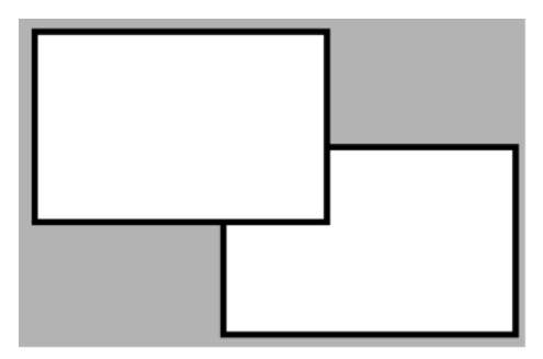
Union  and Intersect
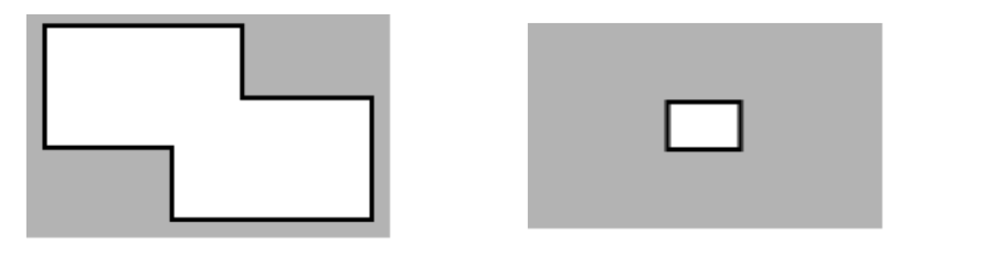
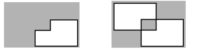
 and Exclusive-Or
Lock element command.  : Select both rectangles then click it to lock. Now the rectangles can not be selected.
- To unlock only one rectangle:
- Click the Direct Selection Tool command
 in the vertical toolbar.
 - Select the desired rectangle and click Unlock Element
 .
. 
- To Unlock all elements, click Unlock All Elements command
 .
.
| Page Tree | ||||
|---|---|---|---|---|
|
...