Page Tree
Other Releases
| Easy Heading Macro | ||||||||||
|---|---|---|---|---|---|---|---|---|---|---|
|
| Info | ||||
|---|---|---|---|---|
| ||||
The following document describes the usage of the Dashboard Displays. |
...
A dashboard is a type of graphical user interface which often provides an at-a-glance views view of key performance indicators (KPIs) relevant to a particular objective.
A data dashboard is the most efficient way to track multiple data sources because it provides a central location for businesses to monitor and analyze performance. The data is displayed in the form of tables, line charts, bar charts, and gauges.
Responsive dashboard displays have the ability to respond dynamically to any display size, which means the display will rearrange to format content based on the size and shape of the user's display.
To create a Dashboard page dashboard display, you need to navigate to the Draw Editor, and click at on the Create Display button.
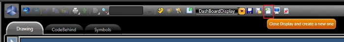
Creating a new display
At In the popup window, enable the Dashboard CheckBoxcheckbox, fill in the other parameters as desirer desired, and click on OK.
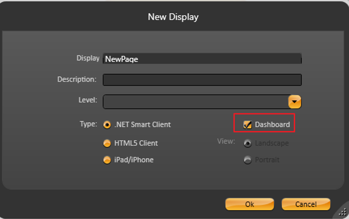 Enabling dashboard.
| Info |
|---|
Dashboards are available for both .Net and HTML5 display types. |
The following elements are available in Dashboard Displays.displays:
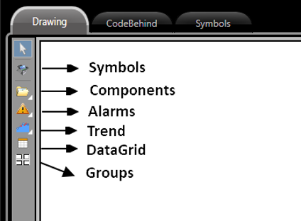
Elements in Dashboard displays.
To use the default graphic Graphic elements , such as buttons, TextBoxes, CheckBoxes, etc), a custom-made symbol with the desired elements is required.textboxes, and checkboxes are not available by default in dashboard displays. To use these graphic elements in your dashboard display, you need to create a symbol with these components and use the symbol in your dashboard display.
Bar Chart | Calculator | Web Browser |
| Pie Chart | Circular Panel | Assets/RemoteAssets Configuration |
Advanced Pie Chart | File Explorer | Child Display |
| 3D Pipe Viewer | External DLLs | Page Selector |
| Report Preview | XPS/PDF Viewer | |
| Map/GMap Control | Report Viewer |
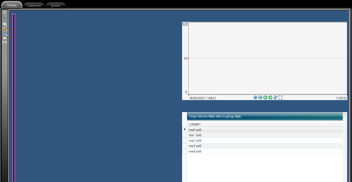
The Draw Editor when When the dashboard option is enabled has its layout , the Draw Editor's layout is configured in blocks.
To insert an element just , select it and drag into it onto the page. You should see a highlighted rectangle in the location where it will be placed.
 Page Configuration.
Elements can easily be deleted (by selecting the element and hit hitting delete on the your keyboard) , or moved (by selecting the element and dragging it )to the desired location.
Dashboard elements have a property called Title that can be accessed through the panel on the left-side of the Draw Editor.
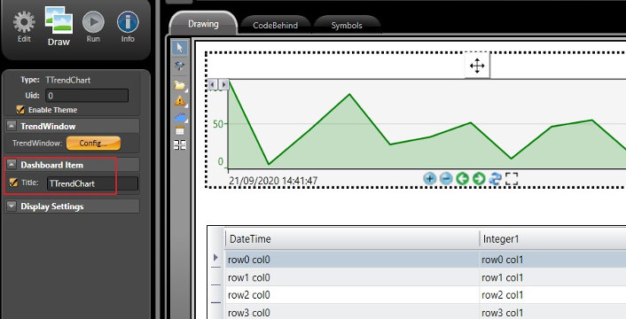
Title Configuration.
...
Dashboards can have their appearance A dashboard's appearance can be modified by applying different Themes. On Run-Extension-Themes, you can create and/or customize many Themes that will be applied to Dashboard different themes to change the look and feel of your dashboard elements.
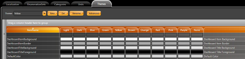
Theme customization.
This feature is enabled on the left Panel CheckBox.
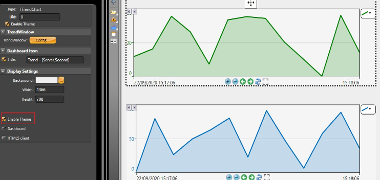
To enable this feature, select the Enable Theme checkbox in the left panel.
Enabling themes.
The Dashboard properties of dashboard items can have their propertied be modified through the callback added to the CodeBehind using the syntax below:
...
Using the .Net callback described above, our Titles would titles look something lieke like this picture in Runtimeruntime.
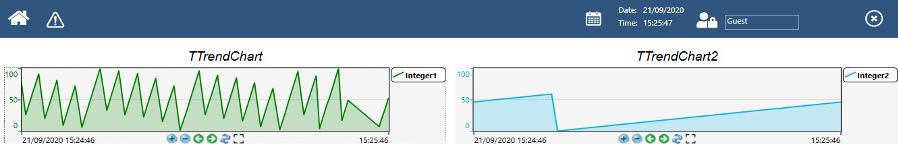
Title in runtime.
The Title also support supports Tags and Project Objects by placing them between curly brackets. The curly Curly brackets are used so the product runtime can handle the element as a project variable, instead of a usual as text. See some examples below.
| Code Block |
|---|
Title: {Client.DateTime}
Title: {Tag.MyTextTag}
Title: {Server.ComputerName} |
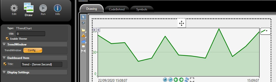
Project Object in title.
With the Project runningIn runtime, the elements can be maximized by clicking on the button at indicated by the (1) below or resized at by dragging the button indicated by the (2) below.
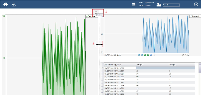 Project in runtime.