This section presents information about the drawing and how to use these features.
About the Draw area
When clicking the Draw button in the ProjectDesigner, the toolbars are changed to present the Drawing Tools.
The Draw area is where you create and edit the displays, create and modify symbols, and do the Display CodevBehind programming.
Some features available in the Drawing tool include:
- Cross-Platform: Use the advanced WPF drawing features to create HTML5 pages.
- Symbols are fully customizable and new symbols can be created from the green field.
- The concept of open Dynamic properties brings the flexibility to deliver any UNI requirement.
- Advanced components for Trending, Alarms, DataGrids, Gantt, Maps, BarCharts and many others.
- Third-party components can be easily integrated, and new built-in components are frequently created. <<<<.please review the content of this paragraph>>>>
- Image files can be imported into the Project as Resources, so you do not need to keep the image file anymore.
- The Image Resources can be applied as a painting Brush to any element.
- Import XAML and AUTOCAD drawings into the system as a vector object.
- Many Productivity tools, like Copy-Paste dynamic properties, edit multiple objects, search replace tags.
- Select the objects in the display, or use the ObjectTree View.
- Flexible Grid Snapping and zoom settings.
Key Concepts
Graphical Element
When drawing displays, any object placed on the screen is defined as a Graphical Element. It can be simple objects like a rectangle, or controls like a CheckBox or TrendChart.
Dynamics
In the context of the Drawing tool, Dynamics are real-time behaviors you can use on a Graphical Element. For instance, you can add the Dynamic of Color Change to Rectangle and define the real-time Tag that will drive the color change.
Image Resources
Image files imported to the Project. The Image Resources can be applied as background color, or even as a Dynamic color change, to any Graphical Element.
Smart Symbols
Smart Symbols — or Symbols for short — is a platform feature that combines graphical Elements with Dynamics properties and connection to the real-time Tags and templates.
The Symbols vastly expedite the creation of Operator Users Interfaces, and simplify the maintenance, as changes on the Symbols propagate automatically to the Displays using it.
Toolbars and Element Properties
Learn how to navigate and use the most common tools in the main design area — the Draw Environment! Like an artist's palette and tools, you can use this area to build almost anything you can imagine!
The Draw area has the following controls to create, format, and configure displays:
- Top Toolbar — On the top, you have buttons to save the display, to select a new displays and other actions on the current display.
- Vertical toolbar — On the left side of the Drawing tab. Use these buttons to draw shapes, add buttons, and create special windows.
- Horizontal toolbar — Across the bottom of the Drawing tab. Use these buttons to group, combine, align, and lock the selected objects.
- Element Properties — The area on the left side displays the Graphical Element Properties. These settings may differ based on the type of object selected. The Appearance parameters dictate the brush style and color used when drawing objects in the display. Clicking the Fill option allows you to specify the colors, gradients, or objects used to fill the graphics.

The Display Setting is always visible on the left side. The configuration fields of the Display, including if the Display is a Page, Dialog or Popup, were discussed in the section Displays and Clients.
Top Toolbar
| Toolbar |
| |
|---|---|---|
| Icon | Command | Description |
| Undo | Undoes an operation/change. This button is available until you save changes. |
| Redo | Redoes a previously undone operation/change. This button is available until you save changes. |
| Cut | Cuts a selected row (DataGrid) or objects (Drawing). This command will delete any select row or object in order to paste it somewhere else. |
| Copy | Copies a selected row (DataGrid) or objects (Drawing). |
| Paste | Pastes a row (DataGrid) or objects (Drawing) that was copied or cut previously. |
| Delete | Deletes selected row (DataGrid) or objects (Drawing). |
| Prints current table (DataGrid) or display (Drawing). | |
| Export | Exports content to an external file as .csv (Tables) or .jpg (Displays) file. |
| Import | Imports an external file to the current table. See Copying and Pasting Rows for more details. |
| Search | |
| Next reference | |
| Previous reference | |
| Add tag | |
| Tag properties | |
| TreeViewer | |
| MDI | |
| Feedback | |
| Help | |

Vertical Toolbar
| Toolbar | Icon | Command | Description |
|---|---|---|---|
|
| Selection Tool |
|
| Direct Selection Tool |
| |
| Hand Tool | The Hand tool can be used to modify the view window. Click once on the display background and hold down the left mouse button. Then, move the display to the desired position. | |
| Edit Properties | Opens properties dialog window of the selected object | |
| Geometric objects tools | Right-click to end the use of each tool. | |
| Rectangle | Creates a rectangle object. | |
| Ellipse | Creates an ellipse object. | |
| Polygon | Creates a polygon object. | |
| Connectors | ||
| PolyLine | Creates a polyline object. | |
| GridLine | Creates a gridline object. | |
| Button | Creates a button object. | |
| LabelBox | Creates a label box. | |
| TextTool | ||
| Text Output | Creates a text output object. | |
| Text Box | Creates a text input/output (I/O) object. | |
| Industrial icons | Insert an industrial icons to be used in the project. | |
| Image resource | Insert an image to be used in the project. | |
| Components | ||
| Symbol Library | The symbol library includes both built-in and user-defined symbols. | |
| Add Symbol | Creates New Symbol with Selected Elements. | ||
| Edit Symbol | Edit Selected Symbol. | ||
| Break Symbol | Break apart Selected Symbol to its elements. |

| Icon | Components | |
|---|---|---|
| Assets | ||
| AlarmWindow | Creates an alarm window. Position the alarm window and double-click it to configure the alarm window settings. For more information, see Configuring an Alarm Window. |
| Alarm Areas | Creates an Alarm Area control that allows you to view the existing alarm tree. |
| Alarm Tree | ||
| DataGrid | Creates a data grid window. Position the data grid window and double-click it to configure the data grid window settings. For more information, see Configuring a DataGrid Window. |
| TreeView | |
Charts | ||
| 3DPipeViewer | Creates a 3D Pipe Viewer object. For more information, see the 3D Pipe Viewer section in the User Interface Controls. |
| BarChart | Creates a Bar Chart object. For more information, see the Bar Chart section in the User Interface Controls. |
| DrillingChart | Creates a drilling chart trend window. Position the trend window and double-click it to configure the trend window settings. For more information, see Configuring the Trend Window. |
| PieChart | Creates a Pie Chart object. For more information, see the Pie Chart section in the User Interface Controls. |
| TrendChart | Creates a trend window. Position the trend window and double-click it to configure the trend window settings. For more information, see Configuring the Trend Window. |
XY Chart | ||
CustomPieChart | Creates an Advanced Pie Chart object. | |
GanttChart | ||
Timeline | ||
Containers | ||
| ChildDisplay | |
HTML5 Control | ||
| PDFViewer | Creates a PDF Viewer object. |
| ReportViewer | Creates a Report Viewer object. |
| WebBrowser | Creates a Web Browser object. |
| WPF Control | Creates an external WPF component. |
Gauges | ||
CircularGauge | ||
CircularGaugeArcPointer | ||
| CircularGaugeCompass | |
CircularGaugeFullCircle | ||
CircularGaugeRanges | ||
CircularGaugeSemiCircle | ||
LinearGauge | ||
CircularGaugeControl | ||
CircularGaugeRangeControl | ||
LinearGaugeControl | ||
Input | ||
Button | ||
| CheckBox | |
| ComboBox | Creates a combo box. |
| ListBox | Creates a list box. |
| RadioButton | Creates a radio button object. |
| Slider | |
| DatePicker | |
| DateTimePicker | |
| DateTimeTextBox | |
| TimeTextBox | |
ColorPicker | ||
MaskedTextBox | ||
NumericTextBox | ||
TextBox | ||
TimePicker | ||
Interaction | ||
| Calculator | Creates a Calculator object. For more information, see the Calculator section in the User Interface Controls. |
FileExplorer | ||
Maps | ||
| ESRI Map | ||
| Google Map | |
| Maps | |
Navigation | ||
| CircularPanel | Creates a Circular Panel object. For more information, see the Circular Panel section in the User Interface Controls. |
| Menu | Creates a menu. |
| MenuItem | Creates a menu item. |
| PageSelector | Creates a Page Selector object.Creates a menu item. |
Horizontal Toolbar
Toolbar |  | |
|---|---|---|
Icons | Commands | Description |
| Grid definition | |
| Screen Zoom | |
| Group | |
| Ungroup | |
| Union | |
| Intersect | |
| Exclude | |
| Exclusive-Or | |
| AlignLeft | |
| AlignHorizontalCenter | |
| AlignRight | |
| AlignTop | |
| AlignVerticalCenter | |
| AlignBottom | |
| Move To The Front | |
| Move To The Back | |
| Change Z-Order | |
| Resize Width | |
| Resize Height | |
| SpaceEvenlyHorizontal | |
| SpaceEvenlyVertical | |
| FlipHorizontally | |
| Flip Vertically | |
| Lock element | |
| Unlock element | |
| Unlock All Elements | |
| Show All Elements | |
| Hide Selected Element | |
Examples
Here you will see examples showing the functionality of the commands of the horizontal toolbar.
The shapes used can be any object without dynamics, like polygons, ellipses, or rectangles.
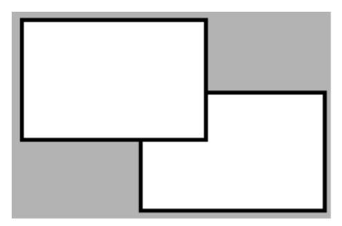
Union  and Intersect
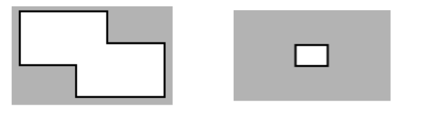
Exclude  and Exclusive-Or
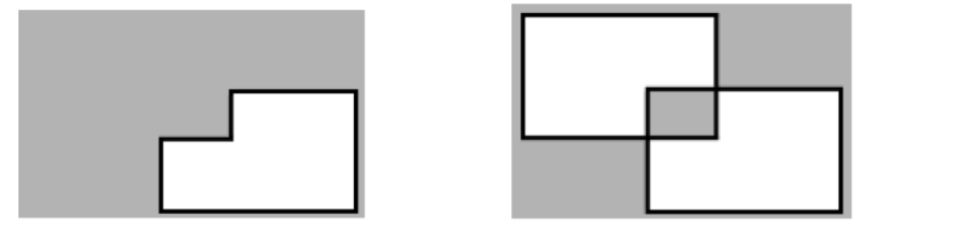
Lock element command.  : Select both rectangles then click it to lock. Now the rectangles can not be selected.
- To unlock only one rectangle:
- Click the Direct Selection Tool command
 in the vertical toolbar.
 - Select the desired rectangle and click Unlock Element
 .
. 
- To Unlock all elements, click Unlock All Elements command
 .
.
In this section...